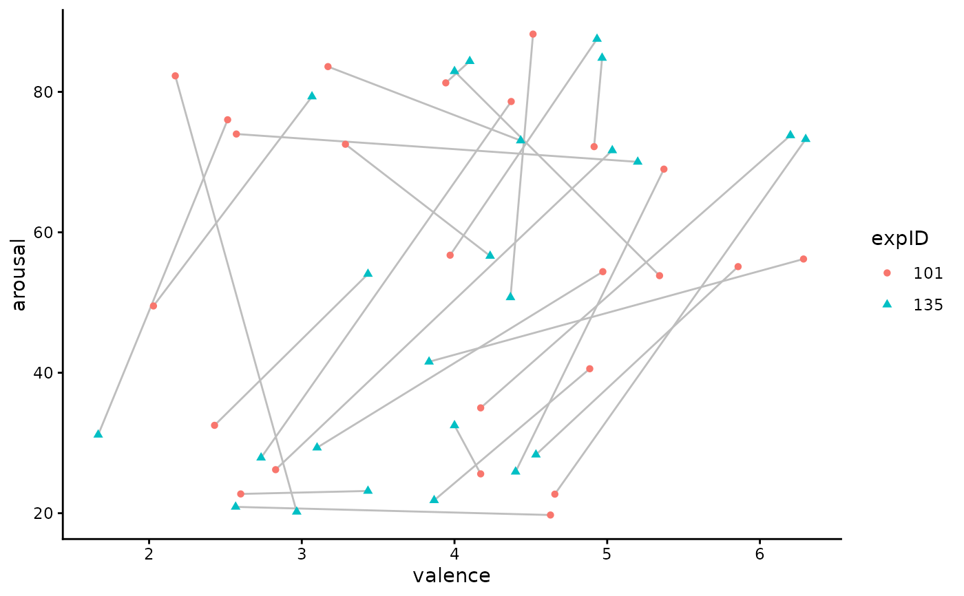
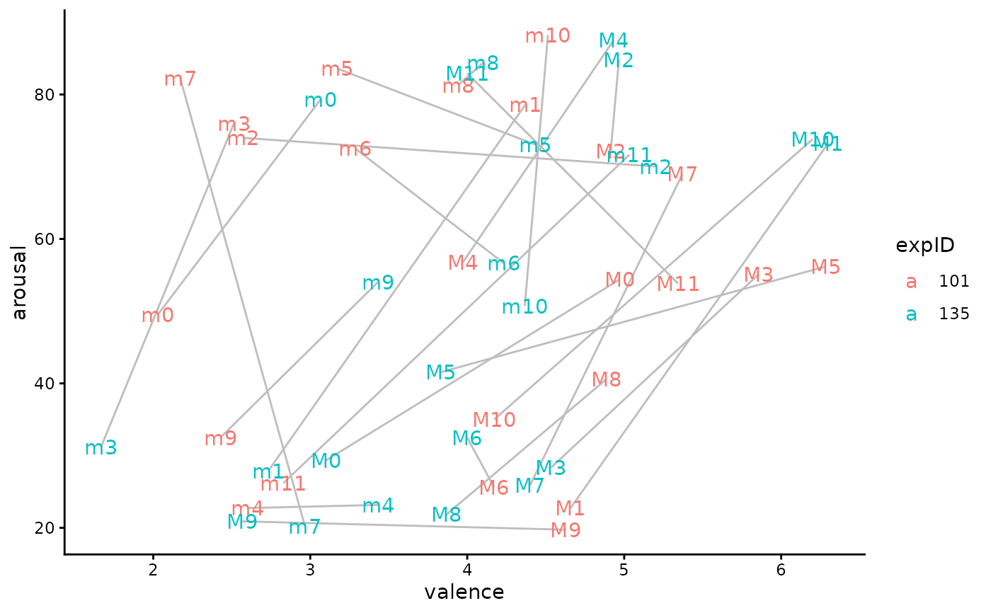
`r lifecycle::badge("stable")` Simple function to visualize paired circumplex data by drawing lines between two matched observations. Useful for showing movement or differences across two conditions (e.g., same pieces by different groups).
plot_paired_scatterplot(
  data,
  x,
  y,
  group,
  group_levels,
  label,
  id_by_shape = FALSE,
  id_by_text = FALSE
)
Arguments
- data
Tibble or data.frame object containing paired observations.
- x
Character. Column name for x variable. Should be passed as a string.
- y
Character. Column name for y variable. Should be passed as a string.
- group
Character. Column name denoting grouping variable with at least two levels. Should be passed as a string.
- group_levels
Character vector of length 2. Names of the two levels within `group` to compare.
- label
Character. Column name of labels for each matched observation (e.g., "pieceID").
- id_by_shape
Boolean. Option to distinguish group levels by shape in the plot; FALSE by default.
- id_by_text
Boolean. Option to add text labels for both groups; TRUE by default.
Value
NULL.
Examples
# Set up data.
dfs <- subset(
df_emosample,
expID %in% c(101, 135)
)
dfs <- dfs |>
dplyr::group_by(expID, pieceID) |>
dplyr::mutate(
valence = mean(valence, na.rm = TRUE),
arousal = mean(arousal, na.rm = TRUE)
) |>
dplyr::select(expID, pieceID, valence, arousal) |>
dplyr::distinct()
#
plot_paired_scatterplot(
data = dfs,
x = "valence",
y = "arousal",
group = "expID",
group_levels = c(101, 135),
label = "pieceID"
)
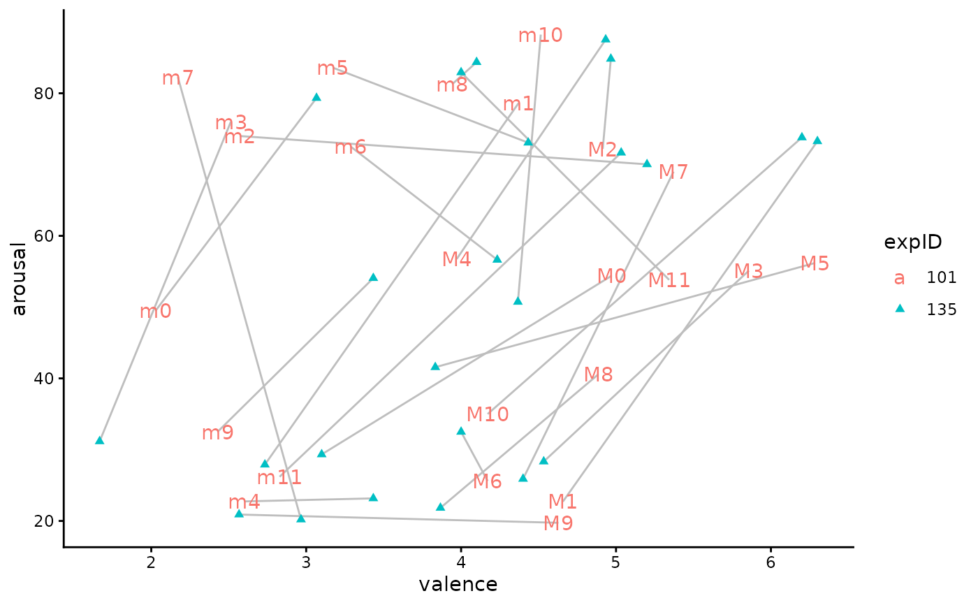 #
plot_paired_scatterplot(
data = dfs,
x = "valence",
y = "arousal",
group = "expID",
group_levels = c(101, 135),
label = "pieceID",
id_by_text = TRUE
)
#
plot_paired_scatterplot(
data = dfs,
x = "valence",
y = "arousal",
group = "expID",
group_levels = c(101, 135),
label = "pieceID",
id_by_text = TRUE
)
 #
plot_paired_scatterplot(
data = dfs,
x = "valence",
y = "arousal",
group = "expID",
group_levels = c(101, 135),
label = "pieceID",
id_by_shape = TRUE
)
#
plot_paired_scatterplot(
data = dfs,
x = "valence",
y = "arousal",
group = "expID",
group_levels = c(101, 135),
label = "pieceID",
id_by_shape = TRUE
)